Tyringham Entrance Front
Tyringham Entrance Front 3/5/13
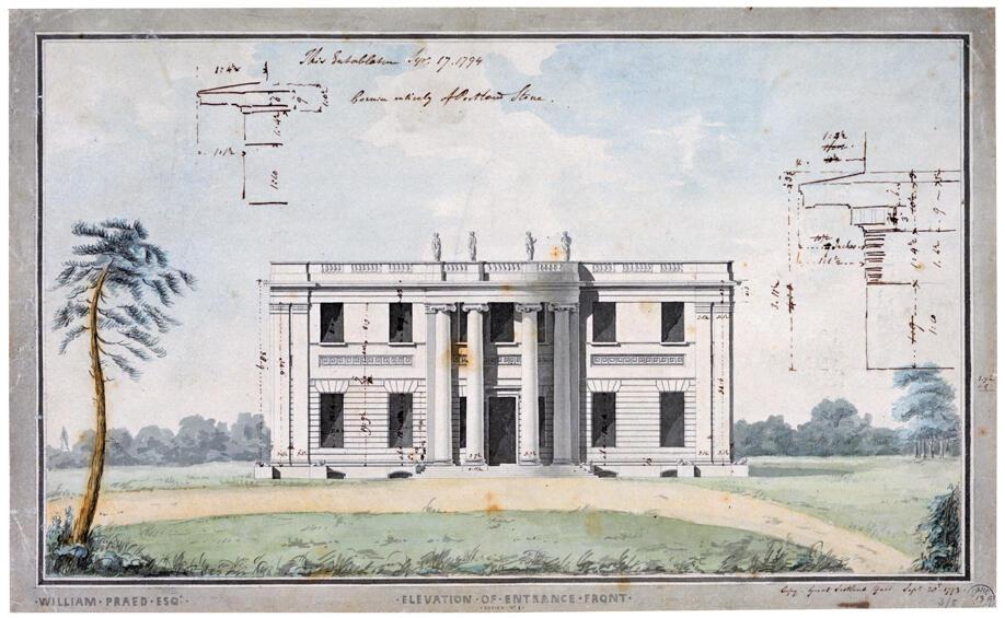
This was the kind of drawing made to impress the client and explain how the building would look. These were very carefully done for a client who might not easily understand more technical drawings. This drawing was made in 1793. Soane has placed a pure elevation in a naturalistic landscape, rather than make a full perspective. Note that Soane has used a modern-looking kind of lettering called sans serif; more traditional letters have little lines or ticks called serifs at the ends of each stroke of the letter, like the letters the Romans used. Sans is the French for ‘without’ and sans serif means the letters have no serifs.